LENSEZ
An easy-to-use contacts lifespan tracking app
A personal UI design project
Objectives
Pre-Design Research
Before conducting the actual design, I have collected all the reviews from the five most popular lens tracking apps in the market. According to the studies, the most frequently mentioned features are simplicity and the essential function of tracking, which also resonated with my design idea.
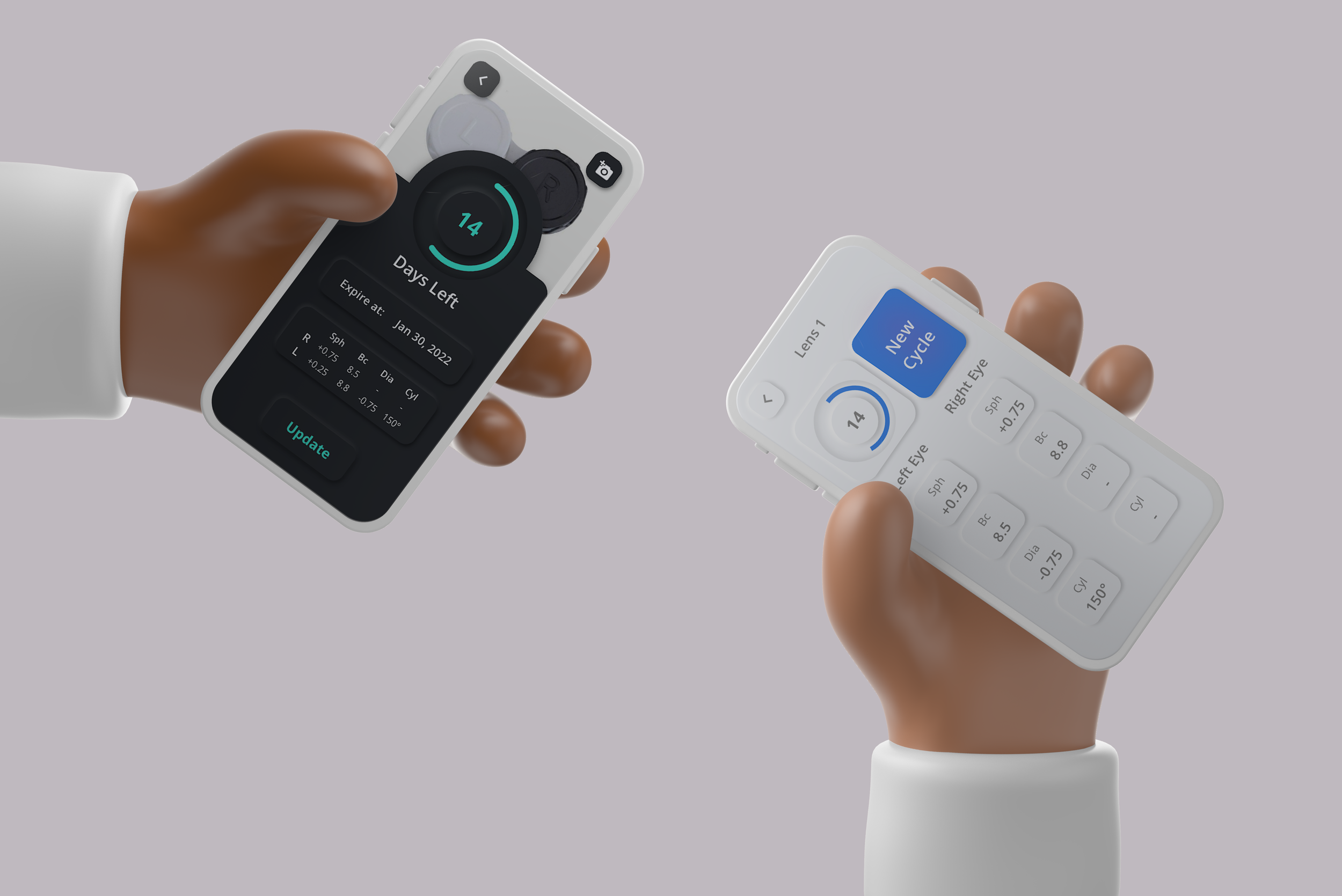
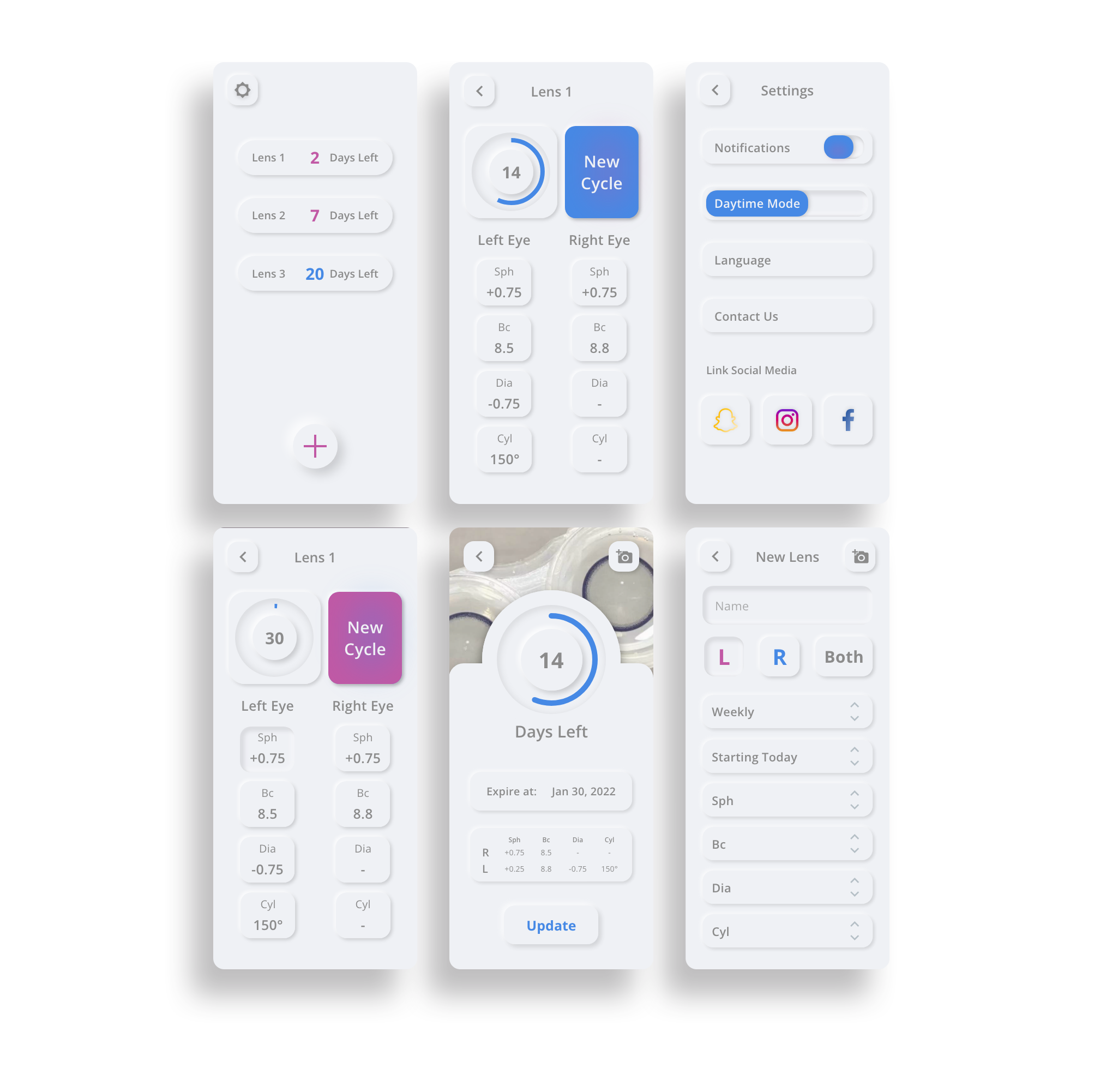
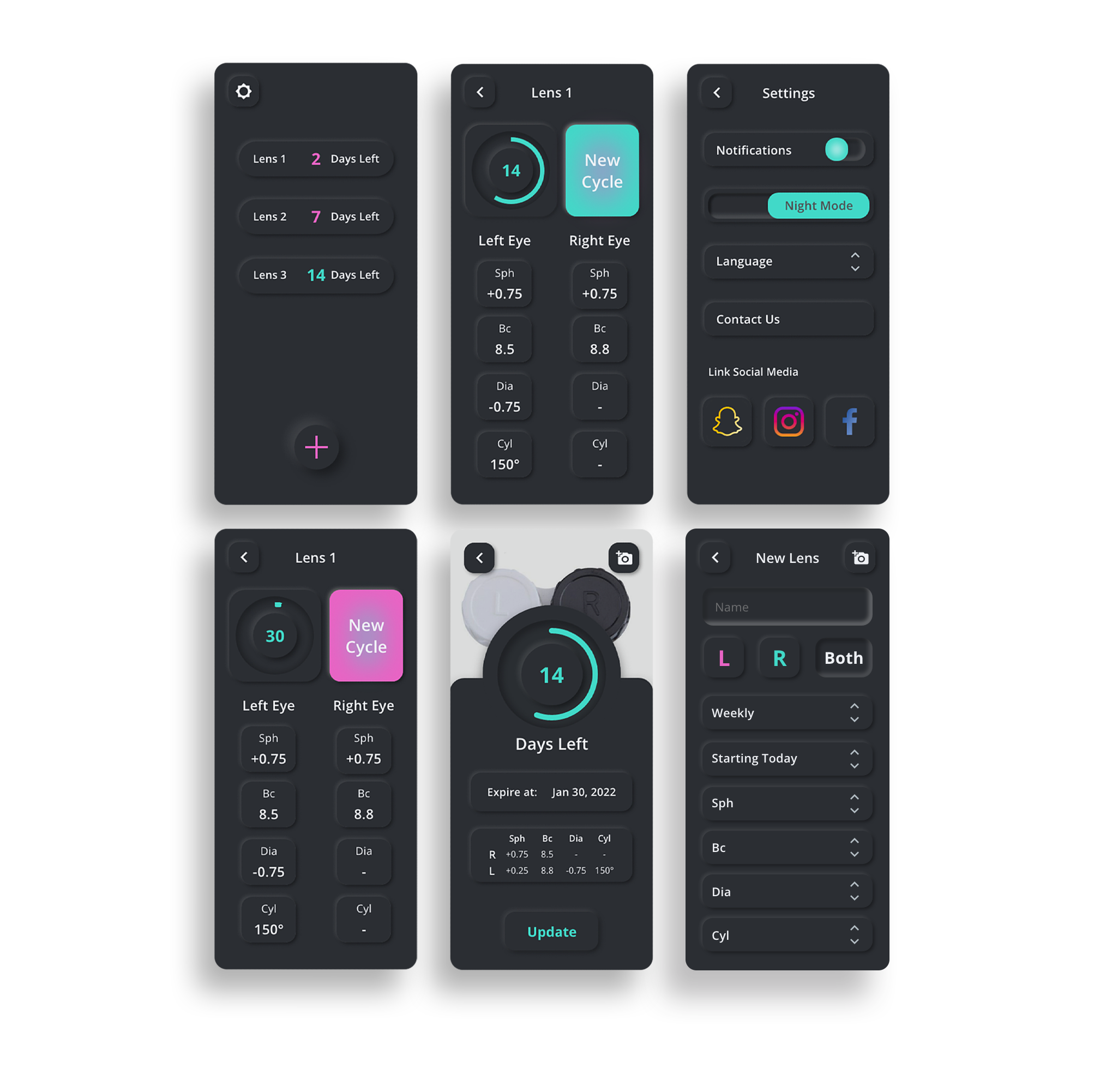
In addition to the basic tracking and prescription recording functions, I also identified users’ needs for keeping the photos of their contacts lenses or boxes to distinguish their contacts between various lifespans, colors, and brands. Therefore, I have integrated a photo showcase interface when users check their lenses. Users can easily keep the record on different devices by linking with their social media accounts in the settings section.
Interface
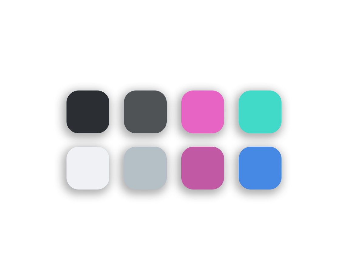
According to the data released by Statista, the male consumers of contact lenses to female consumers was 0.95, so I tried to make the general design more gender-neutral and selected the colors that can represent both genders in my design.
The general design also deployed a neomorphic style that matches the simplicity of the app.
Daytime Mode
The idea was fostered when I was running a self-owned online contact lens boutique. I noticed that many clients were unaware of the importance of tracking the lifespan of their contact lenses.
Therefore, I'd want to create an app with no redundant functionalities that allows users to quickly track their contacts, which is why the app is called LENSEZ (Lens Ease). In this project, I developed a series of interfaces in two different modes (Daytime Mode and Night Mode) using Adobe XD, catering to different life scenarios.
This is a personal project, and all the works were done individually.
Visual Design
Night Mode


